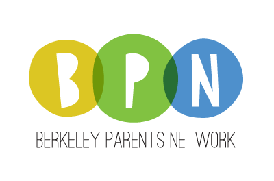
I’m so pleased that the members of Berkeley Parents Network chose my design for their new logo last month! BPN has provided me with all manner of parenting advice, handyman recommendations and other essentials over the years, so I’m happy to be able to give back.
Here’s the official announcement from BPN: “The winning logo, designed by Jeni Paltiel, took the
lead early on, and received nearly twice as many votes as its nearest competitors for peoples’ first choice. It was also the top vote-getter for second and third choices.” Thanks, everyone!
And here’s my designer-y thinking behind the design: The slightly irregular circles are reminiscent of blobs of paint, representing kids and parenting (and our own imperfections!). The different colored circles overlap to symbolize the network/community/connections that BPN fosters. The blue and yellow circles subtly hint at the Berkeley connection without screaming “Cal!” Overall, I was going for a look that was fun and friendly, but not too little-kid-like. I hand-drew the letters “B-P-N,” and the words “Berkeley Parents Network” are in Ostrich Sans by The League of Movable Type, a free/open source font.
Look for the new logo on the revamped BPN website when it launches later this year.