Monday Inspiration: Los Angeles

Exterior of Petersen Automotive Museum in LA

Exterior of Petersen Automotive Museum in LA

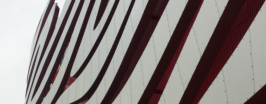
Recently we took a trip to Los Angeles. Being a staunch Northern Californian I was raised to think of LA as a soul-less wasteland of smog and cars (sorry!), but every time I go I discover something new and interesting. This time around we took in some of the region’s architecture (of which I took terrible pictures for some reason), including the Petersen Automotive Museum.

Not being a big car person I wasn’t sure what to expect, but my favorite thing about this museum turned out to be the montage of photos Pixar designers took on their cross-country road trip to get ideas for the look of the original Cars movie. As a designer, I love how obsessively they research every detail, even things that don’t ultimately make it into the final movie. Similarly, Josh Holtsclaw has a great post on his site about the look they created for The Incredibles films, including complete branding packages for entities like the hotel where the Parr family stays.

Since I was reading Susan Orlean’s fascinating The Library Book at the time (and because I’m a library nerd), I also got interested in the history of the LA Central Library building, which led me to the Los Angeles Conservancy (check out their walking tours) and their amazing branding package created by the design firm YYES. There’s also a nice case study about the rebranding, which features ultra-simple, interchangeable icons of iconic LA buildings, here.

I love it when travel not only provides a break from the daily routine, but also opens up my eyes to new design ideas. What travel destination inspires you?

Bandage Stripe fabric

Sometimes I spend a ton of time carefully drawing a million details for a fabric or illustration…and sometimes I get a really simple idea that just works on the first try. “Bandage Stripe” was definitely the latter – it came together really quickly, but the colors make it special.

And I’m thrilled that this design came in 2nd place in this week’s Medical Professions themed contest at Spoonflower – thank you to everyone who voted!

I can see this fabric making great scrubs, an ice pack cover or a fun pouch to hold your first aid supplies – because every 5-year-old will tell you that boo boos feel better when you have a cool bandage (or bandage-themed accessories!).

First aid kit mockup with Bandage Stripe fabric by Lellobird

Wave Your Flag

Being a one-time Nebraskan and an all-time tinkerer-with-things-to-make-them-better, from logos to household appliances, I was super excited to see that Skillshare is hosting a contest to redesign the Nebraska state flag.

I’ve made and re-made a lot of logos in my day, but had never really given flags much thought until I saw Roman Mars’s TED Talk a couple years ago about city flags, where he discusses Ted Kaye’s five basic principles of flag design, which really apply to a lot of design situations.

Kaye’s first rule, “Keep it simple: The flag should be so simple that a child can draw it from memory,” especially resonates with me – I always strive to have logos I design be something you could sketch out with a pen on a napkin and still recognize.

So I got to thinking about Nebraska – I haven’t been there in 20+ years, but in some ways I think that’s helpful when designing a flag, because it’s easier to distill a place down to its essence when you’re not right in the middle of it.

Sandhills photo by Chris M. Morris
Sandhills photo by Chris M. Morris via Flickr / Creative Commons (flag outline added by me)

The number one thing I remembered and loved was the sky – wide and blue, crossed with clouds that cast far-reaching shadows across the open land, filled up with storm clouds and once a gathering tornado I wasn’t allowed to watch, being banished to the basement. So I knew right away the top half of my flag would be blue for sky.

Nebraska cornfield photo by Richard Hurd
Nebraska cornfield photo by Richard Hurd via Flickr / Creative Commons (flag outline added by me)

When I think of Nebraska, I also think of fields of yellow – goldenrod dotted with red-winged blackbirds,
corn tassels, prairie grass, the Sandhills. The current Nebraska flag is also blue with a gold/yellow state seal (like 23 other state flags!), so I liked that these colors refer back to the historic flag.

Nebraska photo by Jodene E
Nebraska photo by Jodene E via Flickr / Creative Commons (flag outline added by me)

Looking at maps of the state, I was struck by how the Platte River makes a graceful swoop across the state, which is almost rectangular, and decided to use that swoop as a distinctive and place-specific way to divide my blue and gold sections. After I went through a few iterations of color and line width, this is my final product:

Proposed Nebraska state flag redesign by J. Paltiel/Lellobird

Having seen other flag re-design missions falter, including Mars’s campaign to revamp San Francisco’s city flag, I’m not sure if this one will officially go anywhere (change is hard, I know). But I’m eager to see what other people come up with!

Proposed Nebraska flag redesign by J. Paltiel/Lellobird

The Cat’s Meow

Cats in Bloom pillow designed by Lellobird, made by Roostery
Above: Cats in Bloom on the appropriately-named Catalan throw pillow by Roostery

Cara from Kitty Curator emailed the other day to say she’d included my “Cats in Bloom” fabric in her recent post about cat fabric designs on Spoonflower. Thanks for the mention! There are some really cute fabrics on the list – if you’re a cat fan, definitely check it out.

Kitty Curator is a “blog about independent artists, designers & makers who create cat-inspired artwork and handmade goods,” in Cara’s words.

Cats in Bloom was inspired by a black cat I used to own who was a complete sweetie, slightly clueless, the clumsiest cat you’ll ever meet, and a world-class purr-er.

Looking at that pillow, I was just thinking this would be a fun design to do a little brightly-colored embroidery on top of, maybe tracing some of the flowers to give it a pop of color. Hmm…

Boxy Foxy

Boxy Foxy fabric by Lellobird, photo by Spoonflower

My Boxy Foxy fabric came in seventh in this week’s Spoonflower Tangrams contest – thank you to everyone who voted! It was fun and a little bit challenging to work with tangrams – they’re easy to draw, because they’re just geometric shapes, but I tried a few different ideas before I found a way to make them visually interesting. I enjoyed seeing how many images I could build with just simple shapes.

Sew Sew

Thread Garden fabric by Lellobird, photo by Spoonflower

This week my design placed 4th in Spoonflower’s sewing-themed fabric challenge.

I’m a bit of a geek about researching and recreating vintage-looking labels and ephemera, from record labels to library circulation cards.

So it was fun to study old wooden spools and come up with my own take on them, combined with stitched leaves, for my Thread Garden design. This was a limited-color-palette contest, using Pantone’s Greenery color of the year, plus black, white and tan. I really like the fresh, spring green of Greenery.

Photo: Spoonflower

The Craftroom

The Craftroom fabric by Lellobird - photo by Spoonflower

I got my start in online design contests doing tee shirts back in the day, so it was especially fun to merge tee shirts with fabric design in Spoonflower’s 2017 T-Shirt Design Challenge.

It was tricky picking a 3-color scheme that would work on both light and dark shirts, but a lot of fun to think of all the things to put in my The Craftroom fabric, from spools of thread to googly eyes to a swatch of one of the first fabrics I designed at Spoonflower. I’m pleased to say my design came in 8th, against some very lovely competition.

I’m already thinking about ways I can use all the bits and pieces from The Craftroom in other projects – you might be seeing that sweet little bird in a blockprint sometime soon!

(Photo by Spoonflower)